

Plano Outdoors
2022Plano tackle boxes are age-old leaders in the sports & outdoors sector, popularized by innovative tech and quality craftsmanship. However, Plano’s visual identity was not equipt for the latest iteration of their progressive tackle boxes.
Logo Refresh
Brand Design
w/ Cactus


Primary
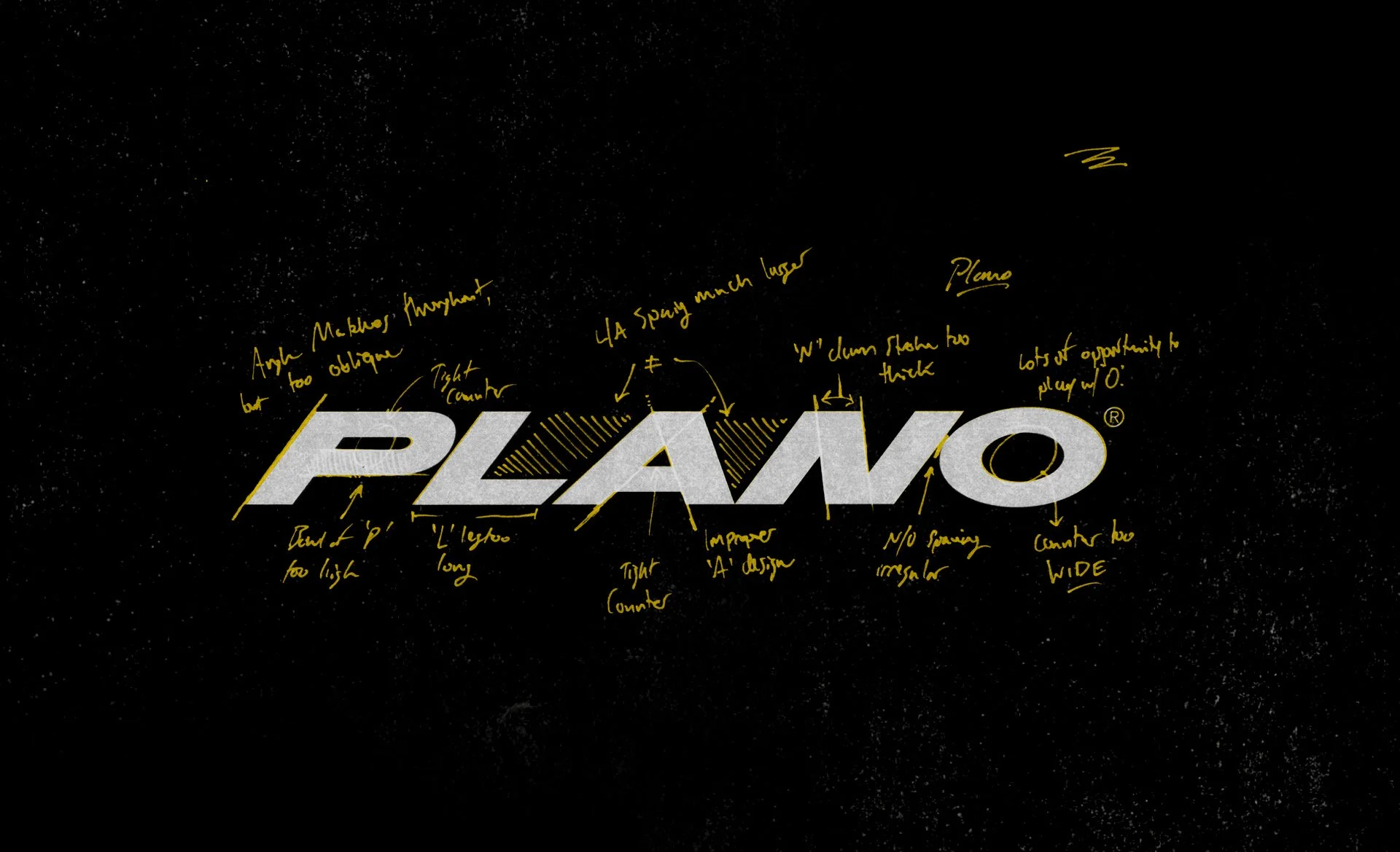
Although early experiments saw “PLANO” completely unsheared briefly, the oblique logo had too much brand equity, power, and character to consider walking away from.
At first glance, the ‘O’ is the only character that underwent significant changes during the refresh, but, as the lead glyph of the mark, the opening of the ‘P’s counter arguably makes a bigger impact to readability.
‘Triple P’

Plano’s classic “Triple P” monogram (that attempts to imitate a tackle box’s fold-out trays) received more than a fresh coat of paint during the refresh. The new mark leverages the same anatomy of the old, but now references the hinge of the mechanic rather than the entire series of trays. Plano’s full wordmark was also jettisoned from the badge, as it will be present elsewhere on products.


Plano’s new visual identity system pays homage to its products with the use of rounded corners and modular grid systems that naturally fit together.


