Disciplines
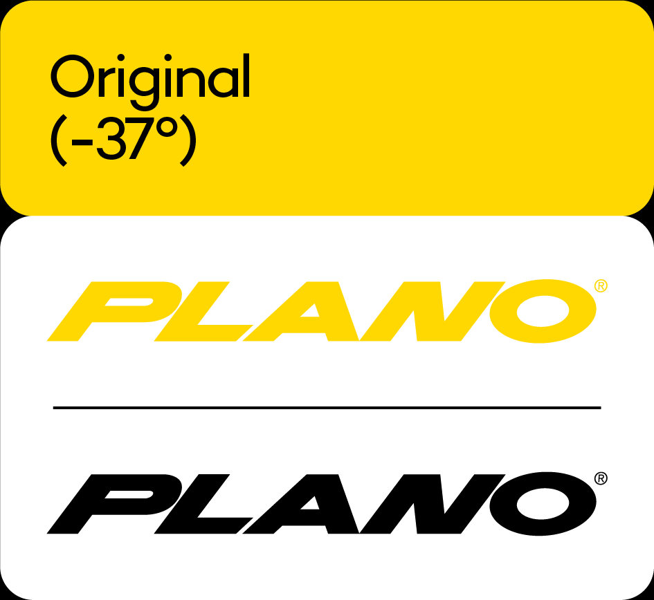
Logo Design
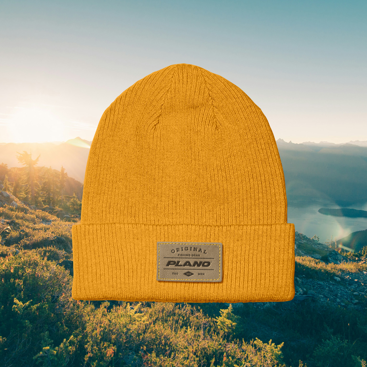
Brand Design
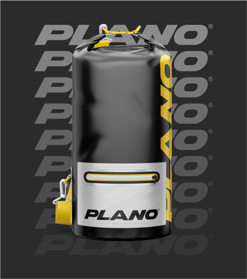
Packaging
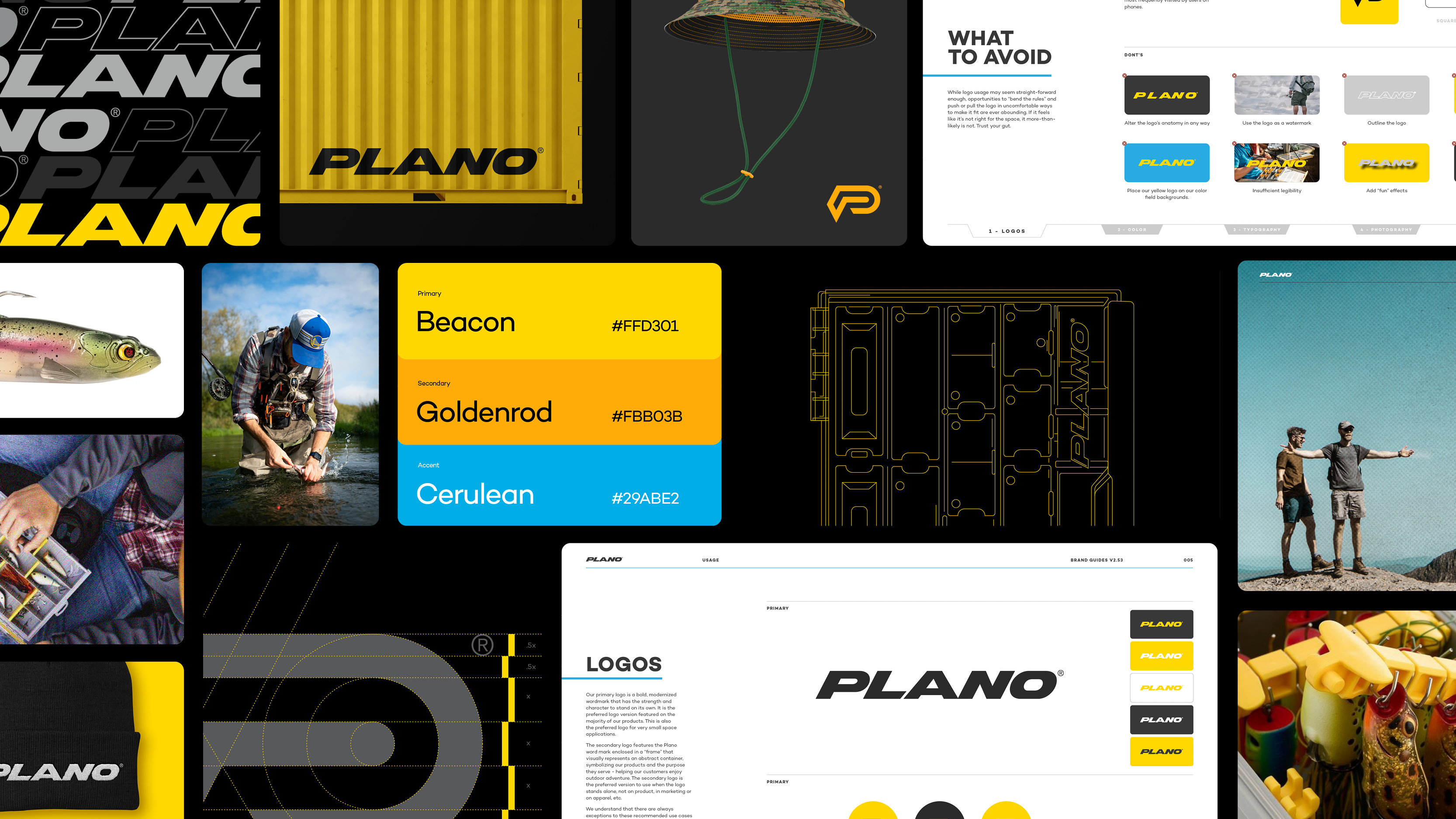
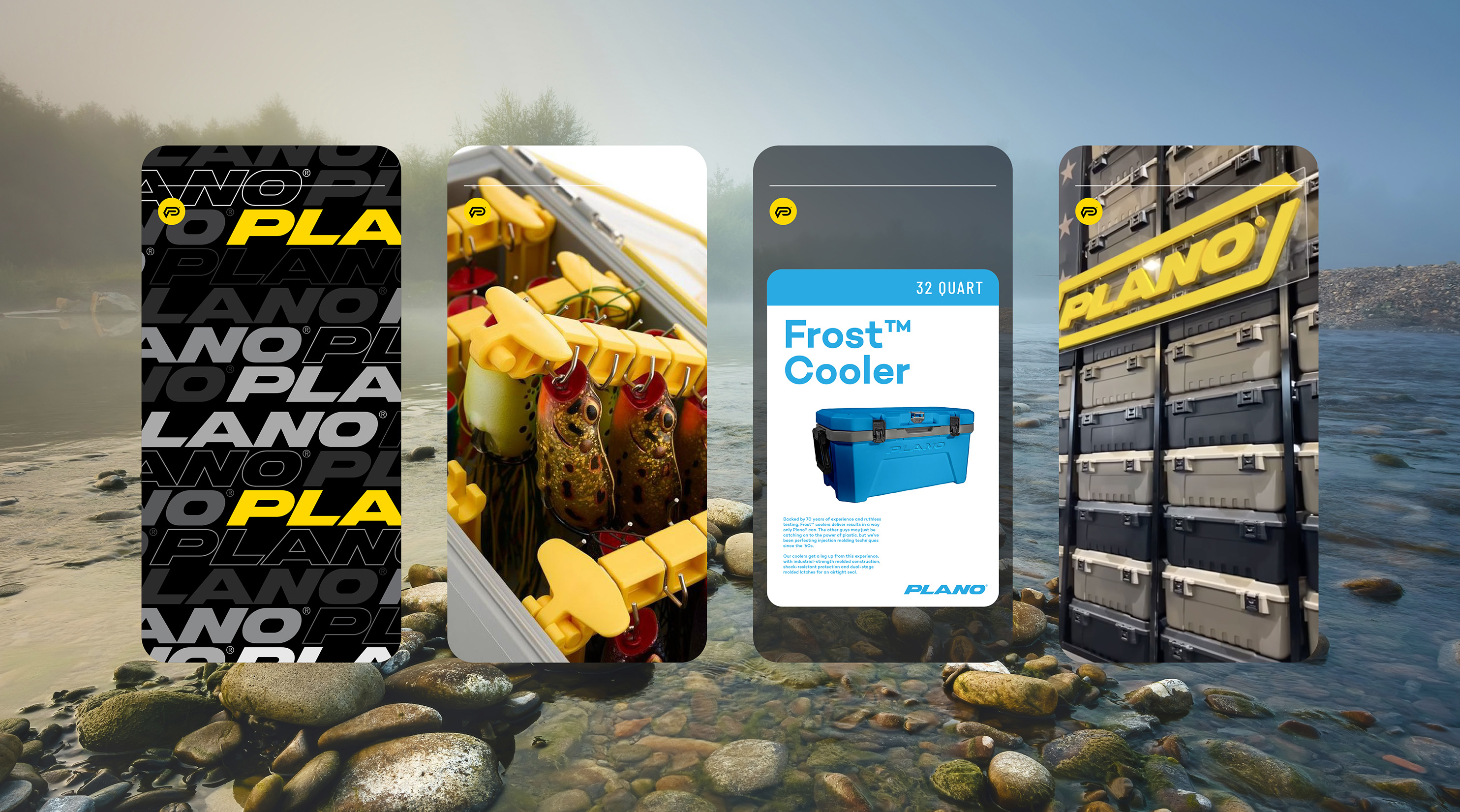
Plano tackle boxes are age-old leaders in the sports & outdoors sector, popularized by innovative tech and quality craftsmanship. However, Plano’s visual identity was not equipt for the latest iteration of their progressive tackle boxes.
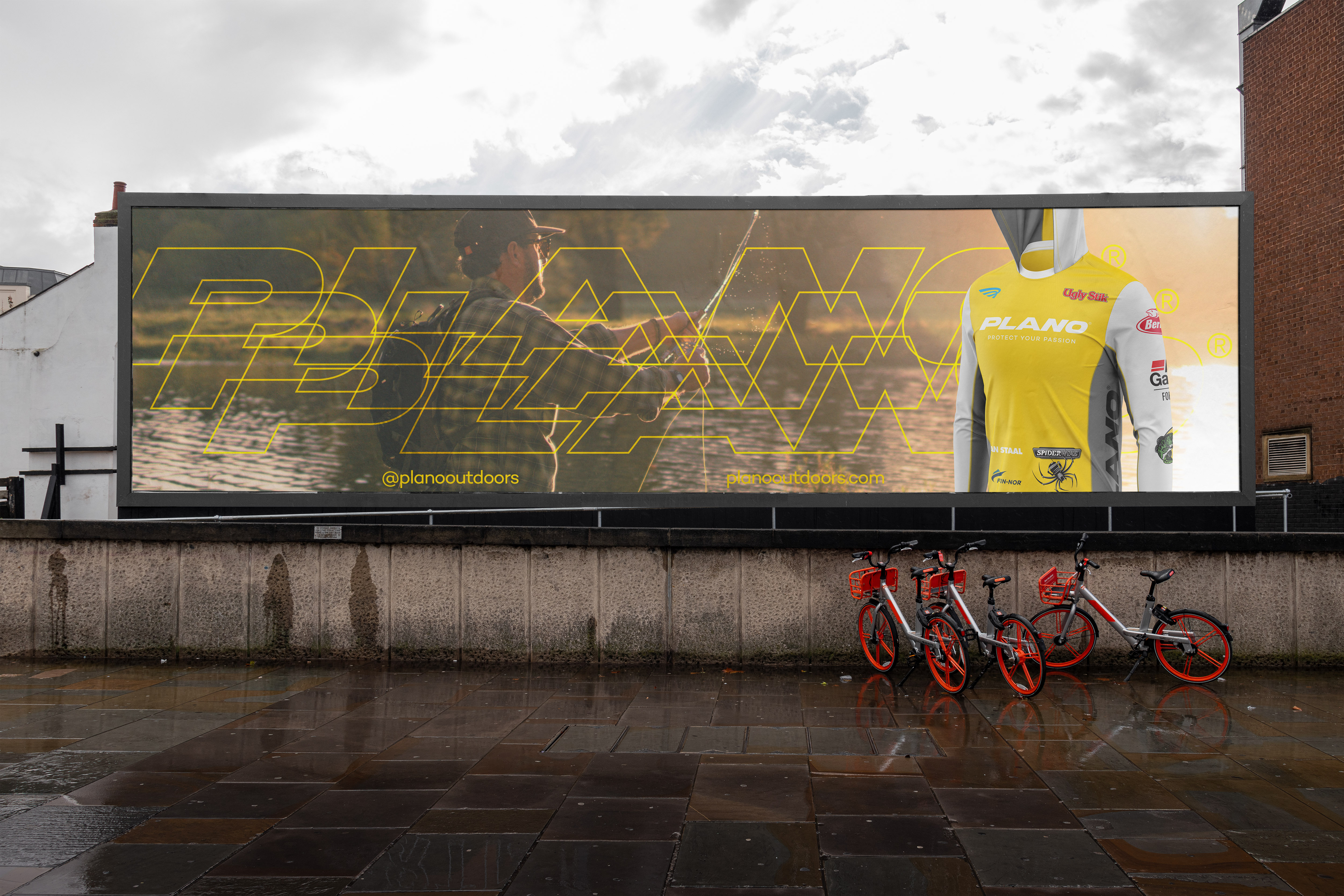
Although early experiments saw “PLANO” completely unsheared briefly, the oblique logo had too much brand equity, power, and character to consider walking away from. At first glance, the ‘O’ is the only character that underwent significant changes during the refresh, but, as the lead glyph of the mark, the opening of the ‘P’s counter arguably makes a bigger impact to readability
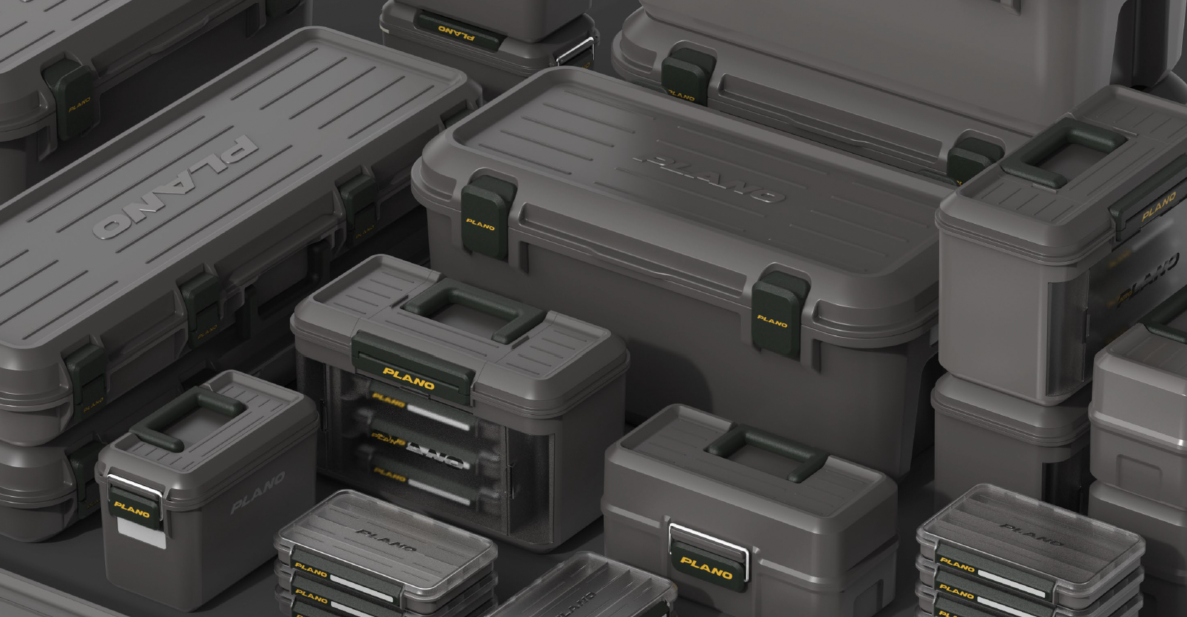


Plano tackle boxes are age-old leaders in the sports & outdoors sector, popularized by innovative tech and quality craftsmanship. However, Plano’s visual identity was not equipt for the latest iteration of their progressive tackle boxes.
Although early experiments saw “PLANO” completely unsheared briefly, the oblique logo had too much brand equity, power, and character to consider walking away from. At first glance, the ‘O’ is the only character that underwent significant changes during the refresh, but, as the lead glyph of the mark, the opening of the ‘P’s counter arguably makes a bigger impact to readability