
RiNo Art District
2023
RiNo Art District is an eclectic ecosystem of artists, businesses, and residents that spans multiple neighborhoods. RiNo’s popularity and overwhelming growth within Denver has seen a myriad of partnerships forged and opportunities undertaken. Working with Vicarel Studios, we had the opportunity to get all of the endeavor’s collateral on the same page.
Logo Refresh
Brand Design
Typography
Apparel
w/ Vicarel Studios
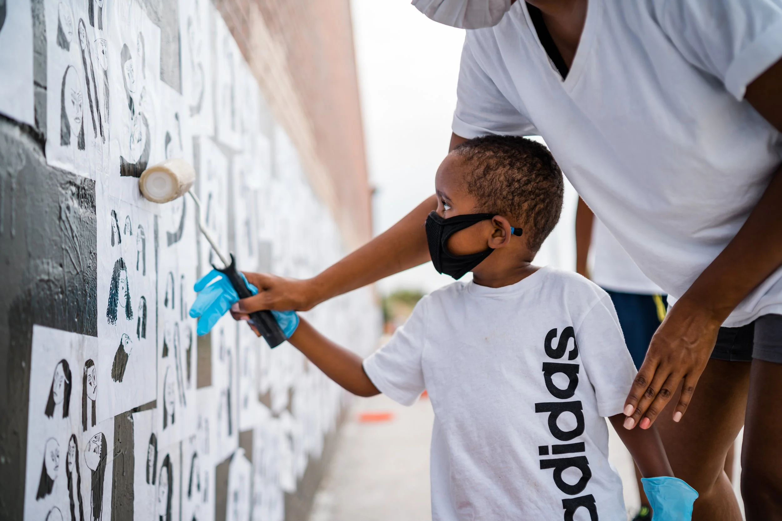


If you’ve even only visited Denver, there’s a good chance you’ve spent time on Walnut Street. On the weekend large sections of the street are closed to traffic, giving access to the district’s many restaurants, breweries, food trucks, and even roller rink. To describe it as “bustling” would be an understatement.

Located on the north side of Denver on the Platte River, (RIver NOrth), RiNo Art District is comprised of 4 neighborhoods and home to many businesses, art studios, climbing gyms, and restaurants.
The Challenge

However, with so many new initiatives and events popping up throughout the year but no identity system to support them, the full weight of the brand had fallen on the shoulders of the beloved orange rhino logo. He needed reinforcements in the design department asap.
Poster layouts, pitch decks, and email templates. From print to digital, all forms of collateral needed updating, including exploration of new logo lockups for RiNo’s new membership program.
Creative Approach

Key pieces
Photography and typography are key elements of visual identity that, when disregarded, easily unhinge a brand’s aesthetic.
We nailed down treatments by immediately solving for our first deliverables: print. Knowing that official RiNo collateral will frequently share space with other eye-catching promos meant picking a style that can easily flex to be one color was important. Whether wheat pasted or printed onto cheap (but bright) paper, our ads will always stick out.


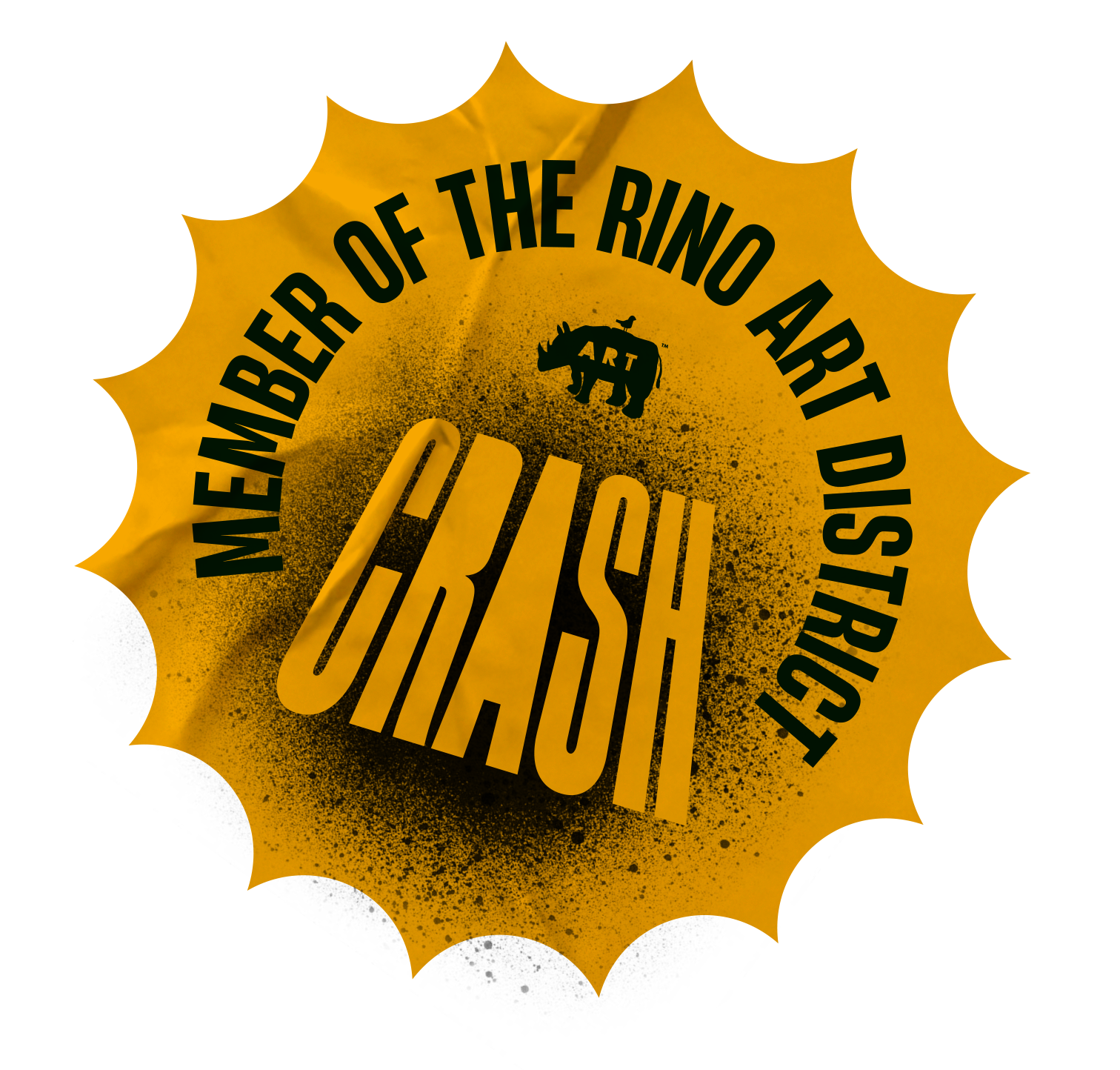
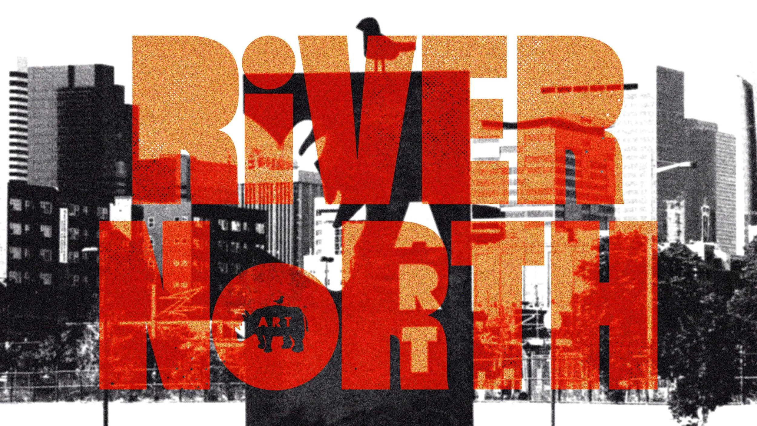
While updating the logo wasn’t part of the project, leveraging the stylized counter-less “ART” in the RiNo logo provided the opportunity to place the old logo within the new typography.


Additional Logos
To further distribute the weight of the branding, we created a system of logos and complementary colors to represent the other neighborhoods in the community.


Digital
Many of RiNo’s social posts pertain to events that are time and place specific and consistently feature partner logos. Developing a consistent and legible system for this info was paramount.