
5 Things I Learned at First Round
A few weeks ago I had the sanctioned pleasure of taking a quick trip to New York for a conference all about my absolute favorite aspect of design: Branding. And not just branding, but the pitch behind the win.
When my coworker Sammie told me about this gathering I was elated at its existence and appalled I had missed so many already (this would be the 8th First Round — a joke that keeps giving each year). This one-day event showcases a baker’s dozen of the world’s best design agencies and freelancers as they each show original presentations made to clients pitching initial design explorations for logo, identity, and branding projects.

Hey that's me! Photo by Sofia Negron

Bryony Gomez-Palacio & Armin Vit of UnderConstruction, photo courtesy of Sofia Negron
These tips were originally part of a presentation I gave to my coworkers at Cactus, so you’ll find I’ve recycled a few of the pages from the deck I created for them below. Believe it or not, I’ve also clipped many of the more granular details and exhilarating insights for time and broader appeal. So if you have any questions, feel free to comment or ask!
*the "Exhilarating Details" I recorded—some of which I've redacted by request of the presenters
1. Speak softly (but still carry a big stick).
One of the first speakers was Sagi Haviv, who’s name you might recognize if you’ve read this far, and who’s work you most certainly will.

Image courtesy of Chermayeff & Geismar & Haviv via cghnyc.com
While brand designers are typically some mix of designer and strategist by trade, there are two other hats that we inevitably don, one more obvious than the other. The first is of necessity; salesperson. The discerning eye might need convincing, but if collaboration creates a product that is greater than the sum of its parts, the end result is often better for it. However, when your client might only be familiar with the logo’s high price tag and the fact that this seemingly ephemeral art project has the shelf-life and implications of a tattoo, you have to remember we also provide a service: the role of educator.
So to find out that Sagi Haviv, Partner & Designer at Chermayeff & Geismar & Haviv, “creators of many of the world’s most iconic and enduring brands,” still has to put the image of the logos his own firm has designed and tell clients “All of these logos were new at one time. It’s going to be scary. Take a deep breath.” I laughed out loud. You’re telling me the designer of the National Geographic logo isn’t trusted by new clients?
And then I realized it isn’t about trust. It’s about hand-holding. It’s about being a leader. It’s about showing, not telling. It’s about caring more than they do. About something they might not totally understand. And instead of scolding them or acting better, demonstrating the potential and excitement of what could be in terms they understand.
He proceeded to share 3 directions* for (don’t look yet!) Wolf Entertainment, telling us that he speaks only briefly at the beginning of each direction to call out any subtle design details that might be overlooked. Each direction featured a simple logo animation of a wolf (what the client asked for) and approximately 25 very tightly curated, industry specific mockups; the logo on the back of director’s chairs, spec websites, red carpet backdrops, stationary, etc. He explained that the large number of applications helps the client get familiar with the work. To paraphrase: “After mockup 15 or 16, they’re living with it now.”
What I realized in that moment was that is how you build trust. Because every new client is facing a different challenge. And the more they care, the harder it will be for them to trust someone else to solve the issue for them. As designers, we have more to offer than perspectives unbridled by industry paradigms. We have the vision they lack and the opportunity to simply show them the answer. But we also have to think 25 steps (or mockups in this case) ahead. We have to consider future hurdles and prepare for unexpected pitfalls — especially if we’re selling an idea that doesn’t fit your client’s/yesterday’s mold.
And with the groundwork laid, Haviv showed us the final and most ambitious logo option. A circle.
But when placed right behind “WOLF,” the glowing orb was just right (beautifully typeset I might add). The animation of the moon was different and exciting and there were a slew of new mockups added in with the previous 25. After getting the client totally warmed up with what they wanted and expected to see they were ready for the toughest, but best option. My takeaway: Finish Strong. Make your best recommendation the last. And go above and beyond to prove it.

Wolf Entertainment’s final logo on their website, the moon.
*most presenters only ever created 2 to 4 directions. With few, if any, promising any specific number of directions/solutions.
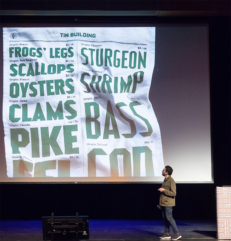
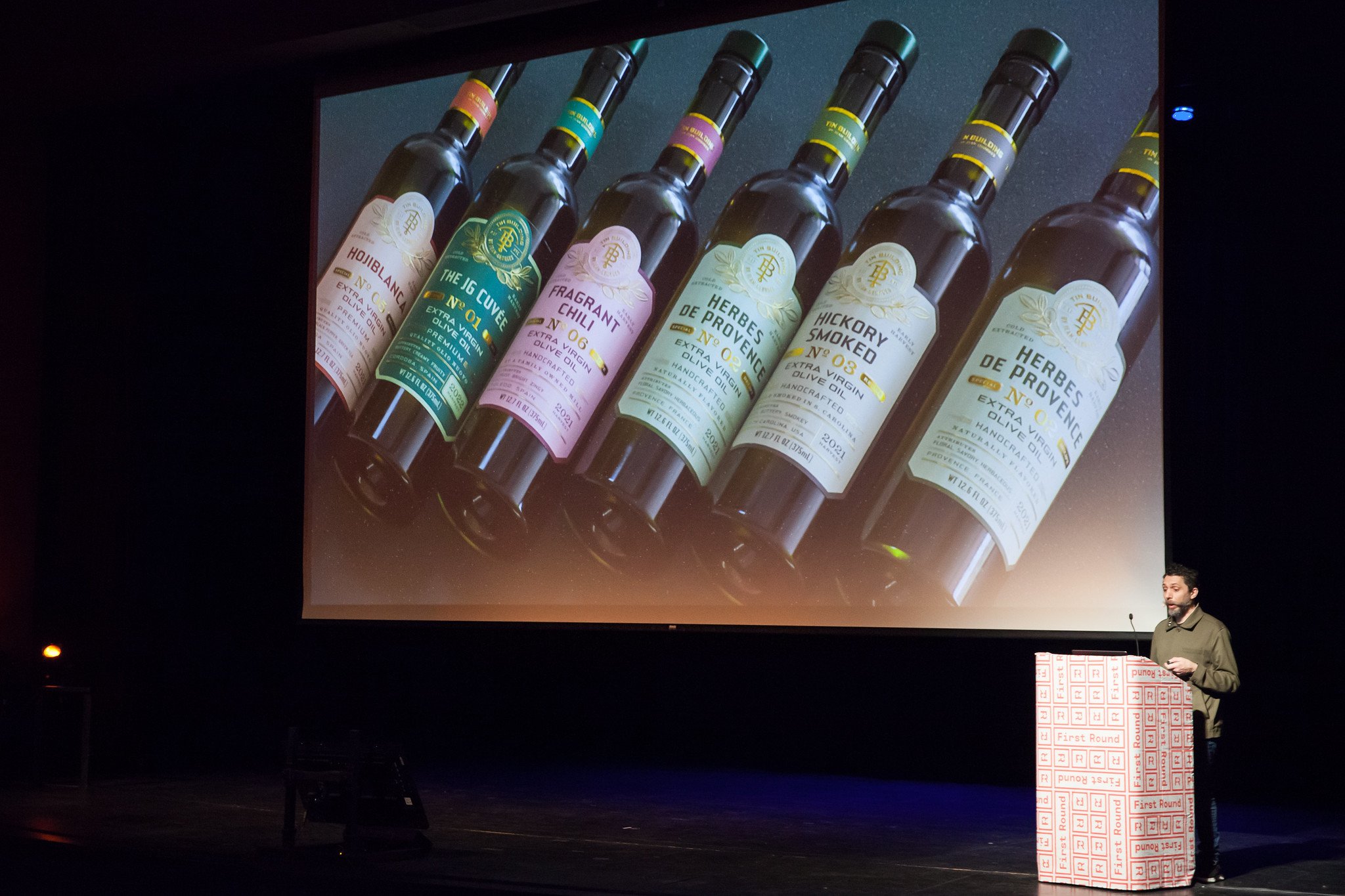
2. “Mood boards are pornography for designers”
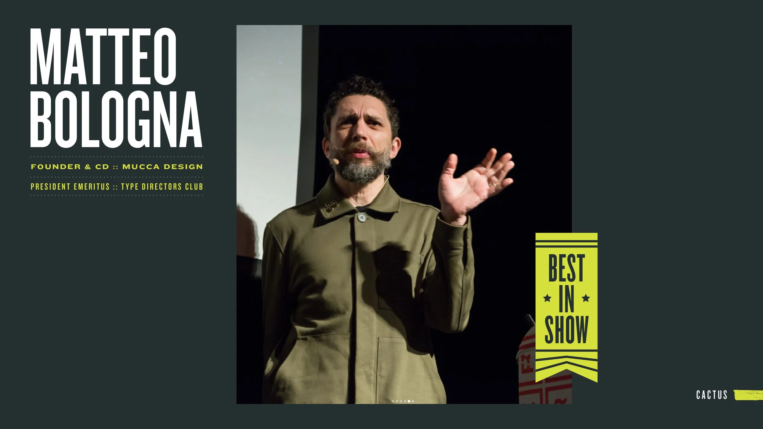
I promise this is the only silly one, but it deserves an honorable mention for a number of reasons. Matteo Bologna, Founder & CD of Mucca Design and the punchiest presenter of the bunch, showed his first round options for NYC’s Pier 17 food hall called “Tin Building.” And it was… *chef’s kiss* relentlessly stunning. A truly massive endeavor, Tin Building required an identity system that could contract to fit a myriad of products and expand to inform the interior and exterior styling of the building itself.
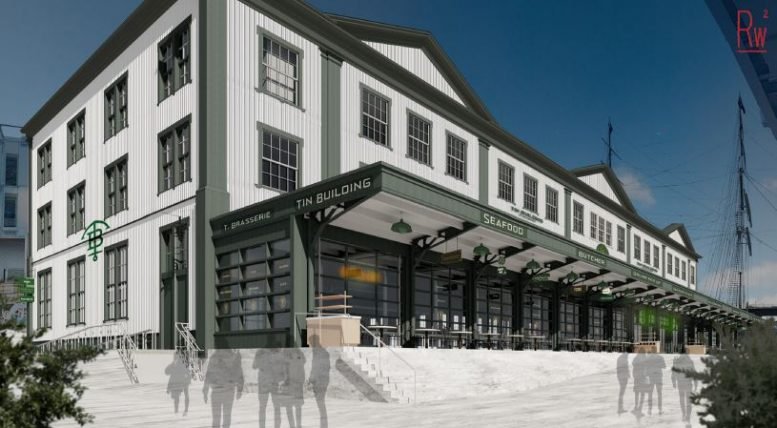
Early building renders from Roman & Williams Buildings and Interiors
Part of his setup was to show the mood boards that established the visual directions his team would be pursuing for Tin Building. The screen was filled with beautifully executed type samples and cleverly articulated packaging. Looking over his should he stated cheekily “Mood boards are pornography for designers.” Little did we know what Matteo had in store for his audience.
For the next 25 minutes we were inundated by ambitious and bulletproof design-thinking. Ingenious signage renders, bespoke mockups, and custom variable typefaces were just a few of the weapons in Matteo’s arsenal. Just as we finished witnessing this beautiful marriage of concept to application (and I was wiping a tear from my eye), he turned back to the crowd and said with a smirk..
“Real pornography.”
Incredible typeface with multiple variable elements— Photo by Sofia Negron
“Real Pornography ;)” — Photo by Sofia Negron
3. The most challenging client.
Challenging clients push you to dig deep, design with authenticity, and tell a unique story. Understanding your client, their industry and their audience is one thing, but making something for someone that really doesn’t know — that doesn’t want to know — is an entirely different can of worms. Watching Trollbäck & Co. present their first rounds for TeenNick really pushed me to think about my own work and the status quo.

Photo by Sofia Negron
Tweens have to be the most ruthless audience to design for and their client understood that entirely. Their client understood that tweens have the ability to see through bullshit with laser vision. Trollbäck was walking a line between authenticity and cringe that was, to me, practically imperceptible. The transformative journey the work went on from first options to final deliverables was remarkable. If brand design is about pulling color levers and twisting typography dials to get look and feel just right, the sometimes microscopic adjustments Trollbäck made had significant implications.
Their productive struggle left me questioning whether I was truly fighting for originality in my own work, or just shoehorning clients into trends that are “good enough,” especially when the bar for improvement is low.
4. Michael Beirut is still learning.
Up until this point in my career, the star power of our industry’s heavyweights had started to wear off on me. Sure Pentagram and Sagmeister & Walsh have done some absolutely incredible work that have totally altered my outlook on branding and design direction, but I’m still actively consuming perspectives from other badass shops and freelancers like Super Top Secret, Andrew Vucko, Jam3, and Agency TK.
What I noticed about halfway through the day was that most of the presenters, including Verena Michelitsch and Mr. Beirut, were there before and after their own presentation. Even some of the greatest minds in design were sticking around to see what insights they could glean from their peers. I know it seems obvious, but there was something special about witnessing that appreciation, self-awareness, and respect from people that are (and have been) role models in our little professional community.
5. “Design isn’t about what we make..

It’s about what we make possible.” — Sanuk Kim, Sr. Designer, Collins.

Sanuk Kim, Sr Designer & Antonia
While everything I saw May 6th was beautiful and enlightening, the very first presentation, Collins’ Sweet Green pitch, really set the tone for the rest of the day. The narratives they crafted and the detail with which they defined and justified their directions was beyond impressive. Their mockups and application examples (strategy distillation, copy tonality, typography use, ui/ux design animations, and photographic direction, among others) clearly demonstrated they had many opportunities to solve the client’s current and potential brand obstacles.
As brand designers, I believe we need to embrace the literal metaphor of an expression we throw around frivolously at times, “brand toolkit.” If we think of a brand like a house, sometimes we’re building/designing a house from scratch (not some cookie-cutter junk either— and already this metaphor is pulling more weight than I intended!) and sometimes we’re renovating or updating. Either way, we should be taking a systematic approach to diagnose current or potential brand problems from the inside out. Wallpaper, fresh paint, and a logo aren’t going to prevent the roof from caving in if the foundation is settling. If the client is looking to start a family in the next year, it might be advantageous to start planning for an addition sooner rather than later.
What we’re doing is not only giving our clients the tools to work on their own home, we’re teaching them how to read the blueprints, use the tools, and command their own future with confidence. It’s fun to create new logos and find unexpected branding collateral, but it’s even more satisfying to know that a client has everything they need to be the their best selves going forward.
Final thoughts
Going to this conference, I knew my mind was going to be blown. However I think the scope and level of work account for a large portion of that excitement. Because more-so than anything else, the opportunity to get a peek under the hood of these massive projects helped crystalize a lot of ideas about presentation design that, up until this point, were conjecture. Presentation design is about understanding, timing, and trust.That is how you win others over.